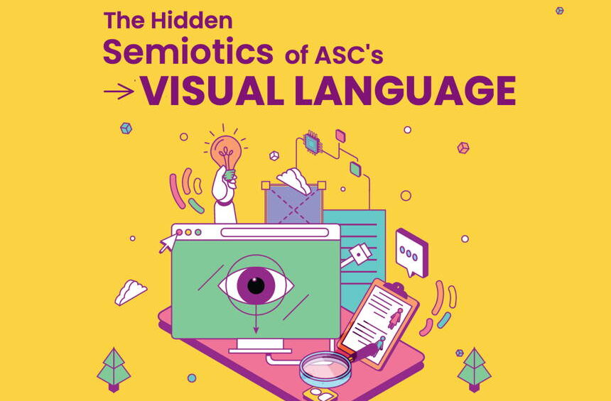
The Hidden Semiotics of ASC’s Visual Language
Building a visual world that can evolve with the research technology community
by Adhrusha Ganesh
“The world is full of obvious things which nobody by any chance ever observes.“
Arthur Conan Doyle, The Hound of the Baskervilles
A visual language becomes interesting when you start looking beyond what is immediately obvious. A colour can become an anchor. A pathway can suggest movement. A character can make an abstract idea feel human. A collection of small details can come together to tell a much bigger story.
When ASC reached out about the branding for their November 2024 conference, I started by looking through their existing website and visual communications. What struck me was that, although ASC had a long history and a strong reputation within the research technology community, there wasn’t yet a visual language that immediately gave the organisation a distinctive sense of identity.
I decided to approach the brief as something bigger than creating a visual identity for a single conference. I wanted to build a world, one that could continue to evolve with ASC while still feeling recognisable and distinctly its own.
The starting point was the purple from the ASC logo. I wanted this to remain the anchor of the visual language, but I also wanted to build a broader palette around it. Rather than making the colours feel fixed or restrictive, I wanted them to give us room to respond to different subjects and moods. A visual could be led by yellow, teal, pink or purple depending on the story it needed to tell, while still feeling unmistakably ASC.
One of the biggest questions for me was how to represent an organisation whose subject matter can be quite technical without falling into the usual technology clichés.
Technology is often represented through screens, circuits, code, grids or futuristic interfaces. These things can communicate technology very quickly, but they can also make an idea feel cold, distant or overly corporate.
For ASC, I wanted the people using the technology to be just as important as the technology itself. The characters within the illustrations are often researching, collaborating, presenting, building, analysing or simply trying to solve a problem. They bring a sense of activity and personality to the visual world. That human presence has become an important part of the visual language and, in many ways, reflects the community that sits behind ASC.
The small story within the bigger one
Another idea that has shaped the work is my interest in small stories within a bigger story.
I wanted the larger composition to communicate the main idea quickly, but I also wanted there to be details that rewarded someone for looking a little longer.
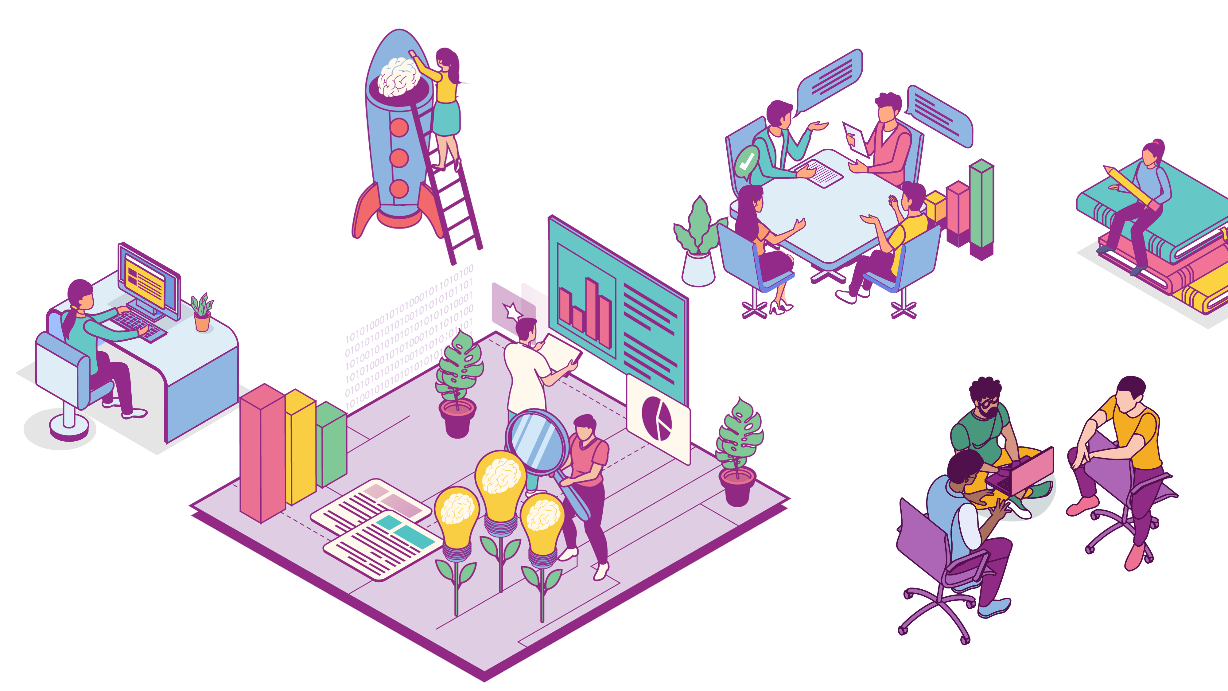
Image above: The small stories make up the bigger one
A character examining something through a magnifying glass might suggest research and discovery. A staircase can represent progress. A bridge can suggest transition or connection. Arrows and pathways can represent movement between ideas, while gears can suggest different processes working together.
These metaphors don’t necessarily need to be explained. They are little visual cues that allow the audience to make their own connections and build an understanding of the image. This is also where the isometric approach became useful. It allowed multiple stories to exist within the same environment. Rather than presenting an idea as one single, linear statement, the viewer can move through the illustration and discover different interactions taking place.
The illustrations became a collection of visual ingredients: characters, platforms, objects, shapes, pathways and graphic devices that could be brought together in different ways. The intention was never to create a bank of standalone illustrations. I wanted to create a flexible visual system that could grow with every new brief.
One visual language, many different stories
As the work for ASC has continued, the challenge has been allowing the language to adapt to very different briefs without losing what makes it feel like ASC.
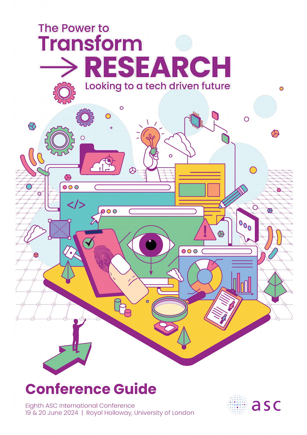
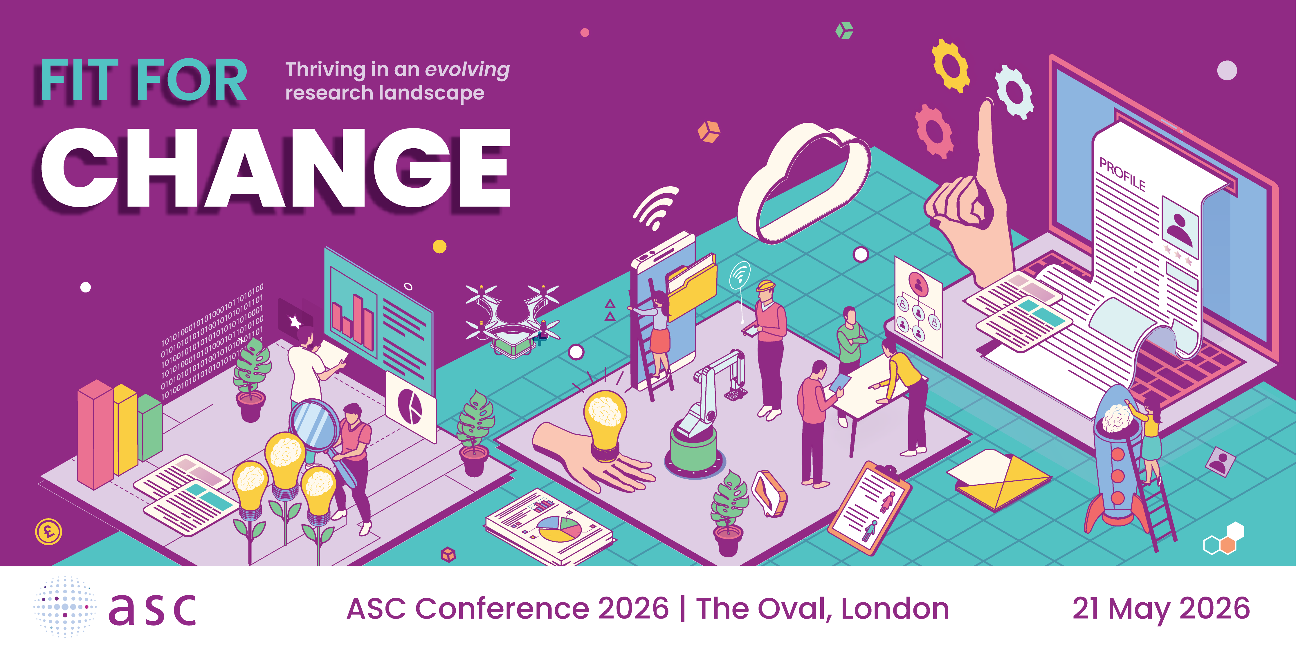
The International Conference established much of the original visual world. It gave the system space to be expansive and energetic, bringing together people, technology, research and ideas within a single environment.
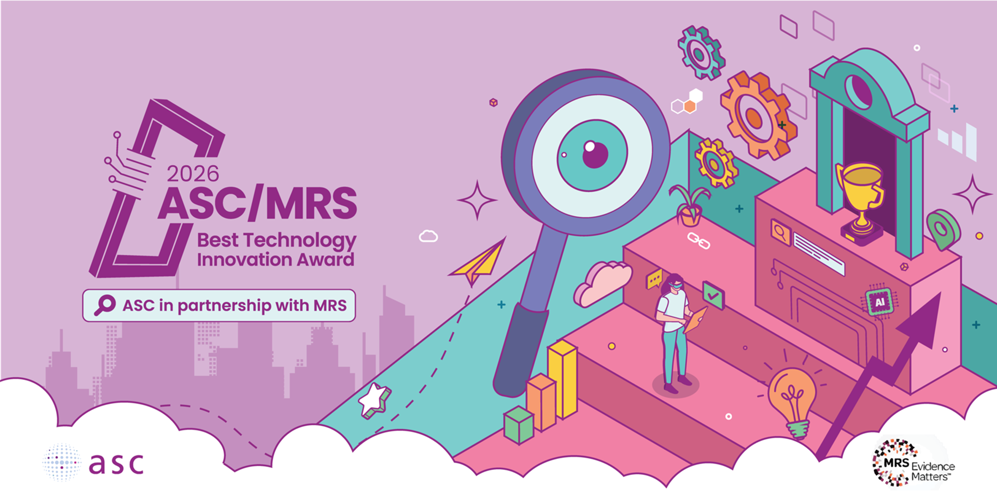
A design for the Annual Technology Award introduced a different tone. The same visual language could become more focused around achievement, recognition and progression, using visual metaphors such as targets, magnifying glasses, trophies and ascending structures.
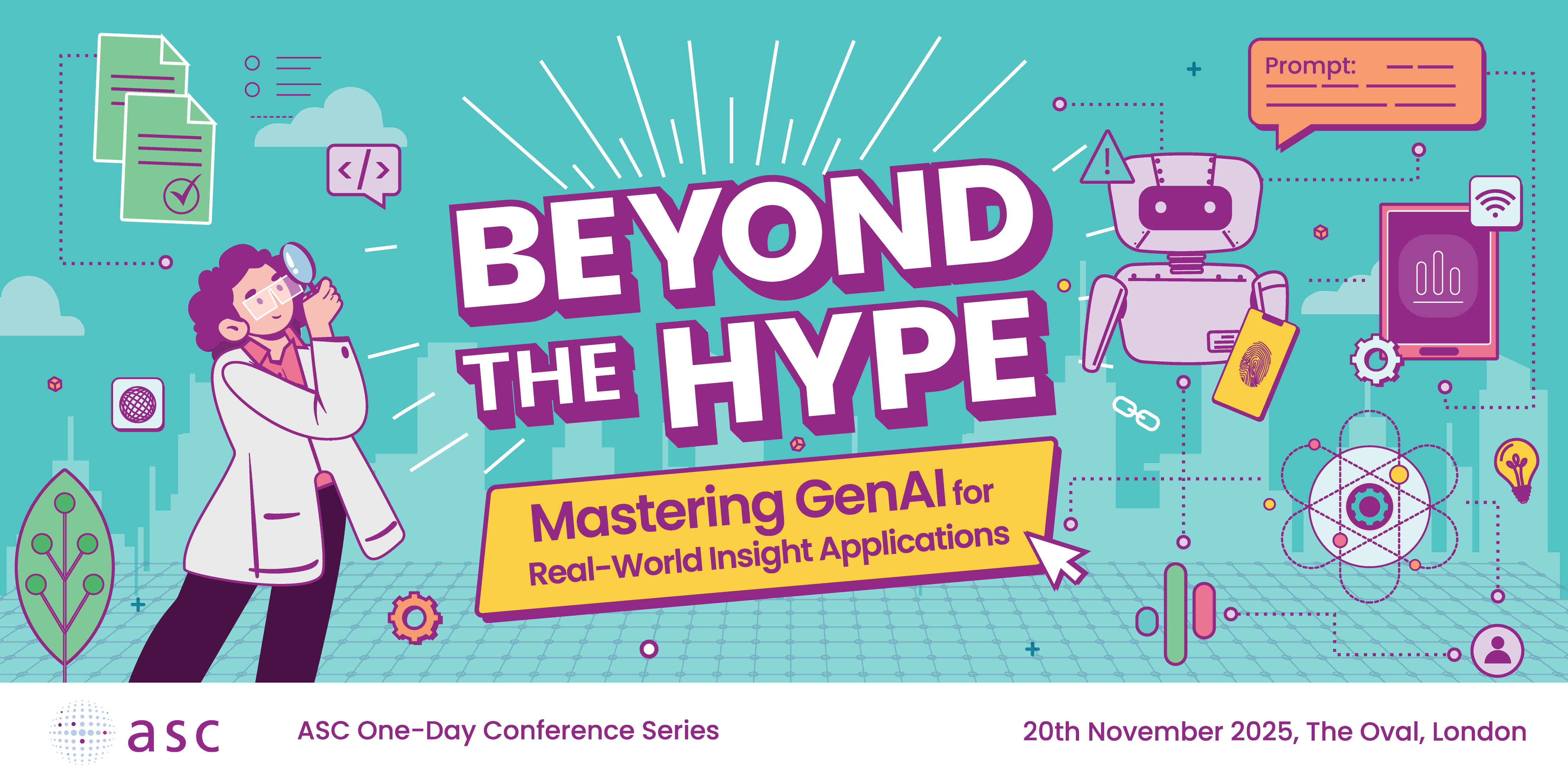
The One-Day Conferences work gave us another opportunity to push the system in a more specific and playful direction while keeping the same underlying DNA.
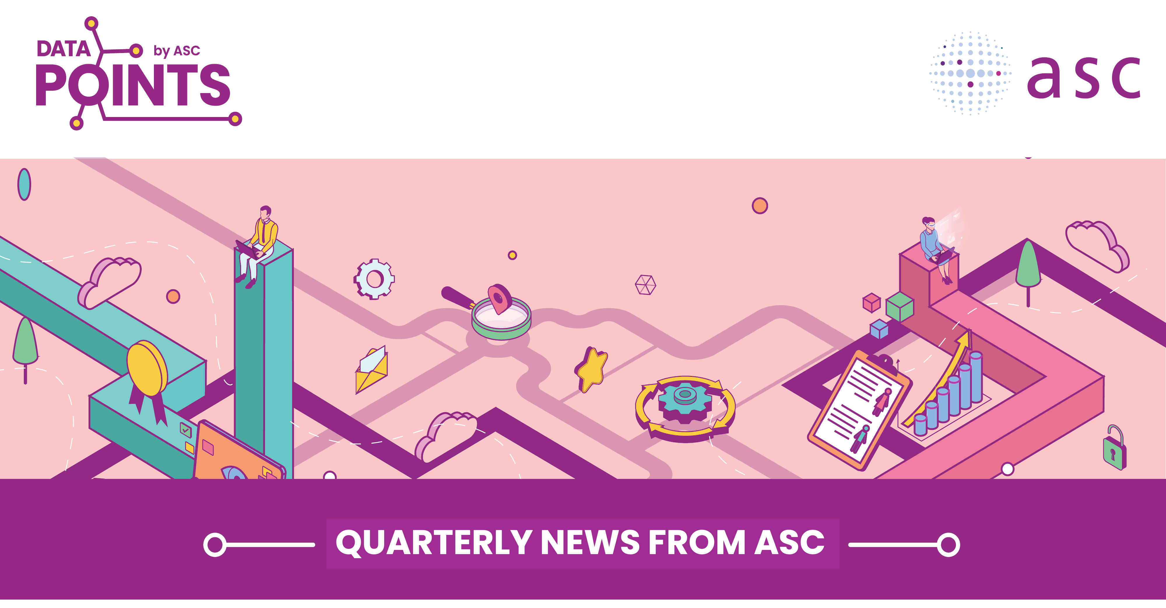
When creating a design for ASC’s quarterly newsletter, Data Points, the emphasis shifted towards information and communication. The visual language needed to work within a newsletter and content environment, so the illustrations became a way of showing information moving between people and ideas.
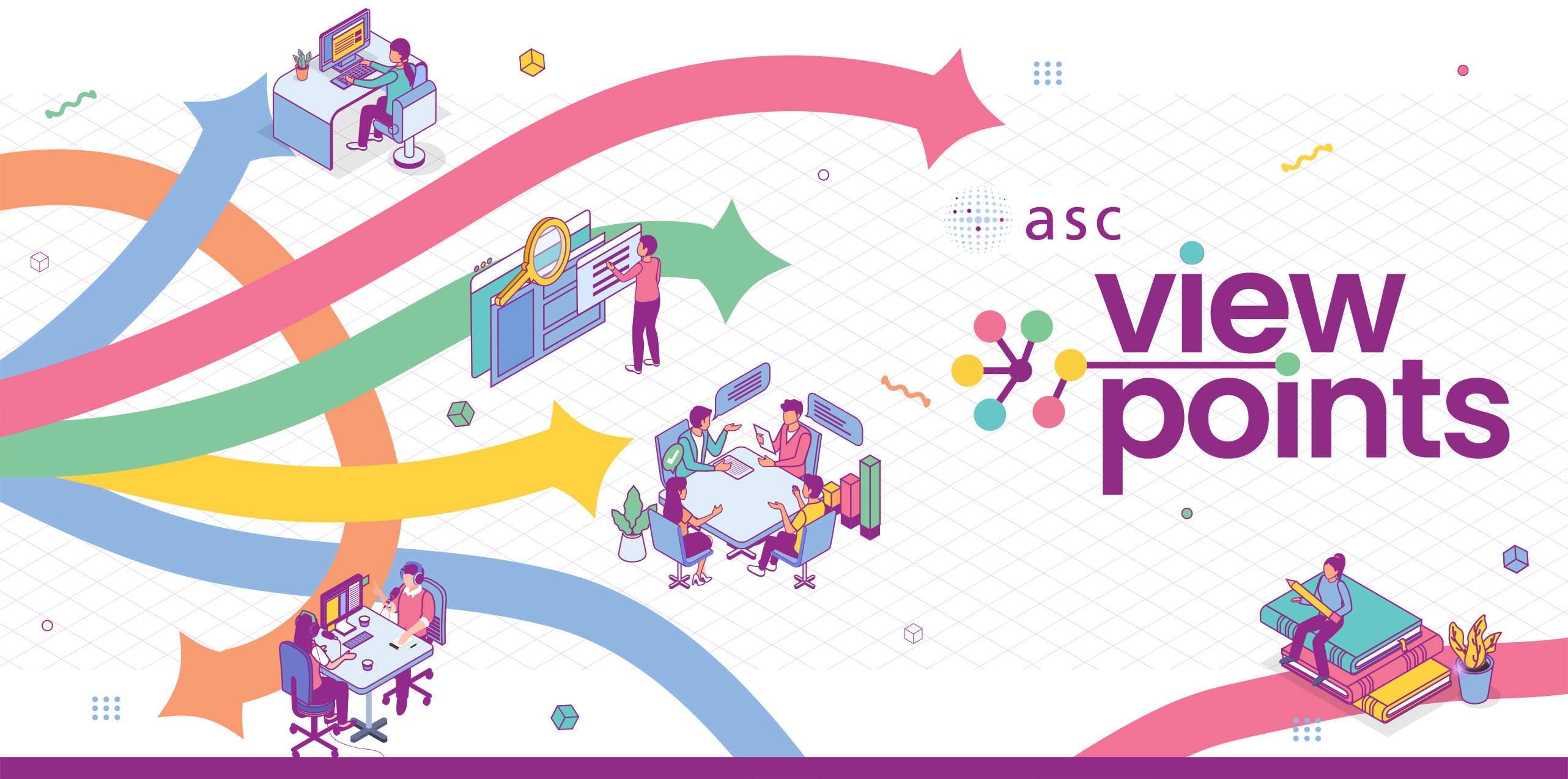
Most recently, Viewpoints explores the idea of different perspectives coming together. Its content, sourced from independent, expert contributors, can take the form of articles, videos, podcasts, interviews and discussions, so the visual language needed to represent not just the content itself, but also the people and perspectives behind it.
The common thread across all of these is not one particular illustration or colour combination. It is the underlying vocabulary.
A system designed to keep evolving
The most important decision was making the visual language flexible from the beginning.
ASC has a long history, but it operates within an industry that is constantly changing. New technologies, new ways of working and new conversations will always create new briefs. I didn’t want the identity to become a fixed style that eventually started to feel repetitive. Instead, I wanted to create a set of visual tools that could respond to those changes.
For me, the success of the system isn’t about whether every ASC communication looks the same. It is about whether you can come across something new from ASC and still recognise the same visual thinking behind it, and that has been one of the most rewarding parts of seeing the work develop.
And perhaps that is the hidden semiotics of the work. ASC isn’t represented by one single idea. It is represented by a community of people, perspectives, technologies and conversations, all connected by a visual language that can continue to grow and change alongside them.
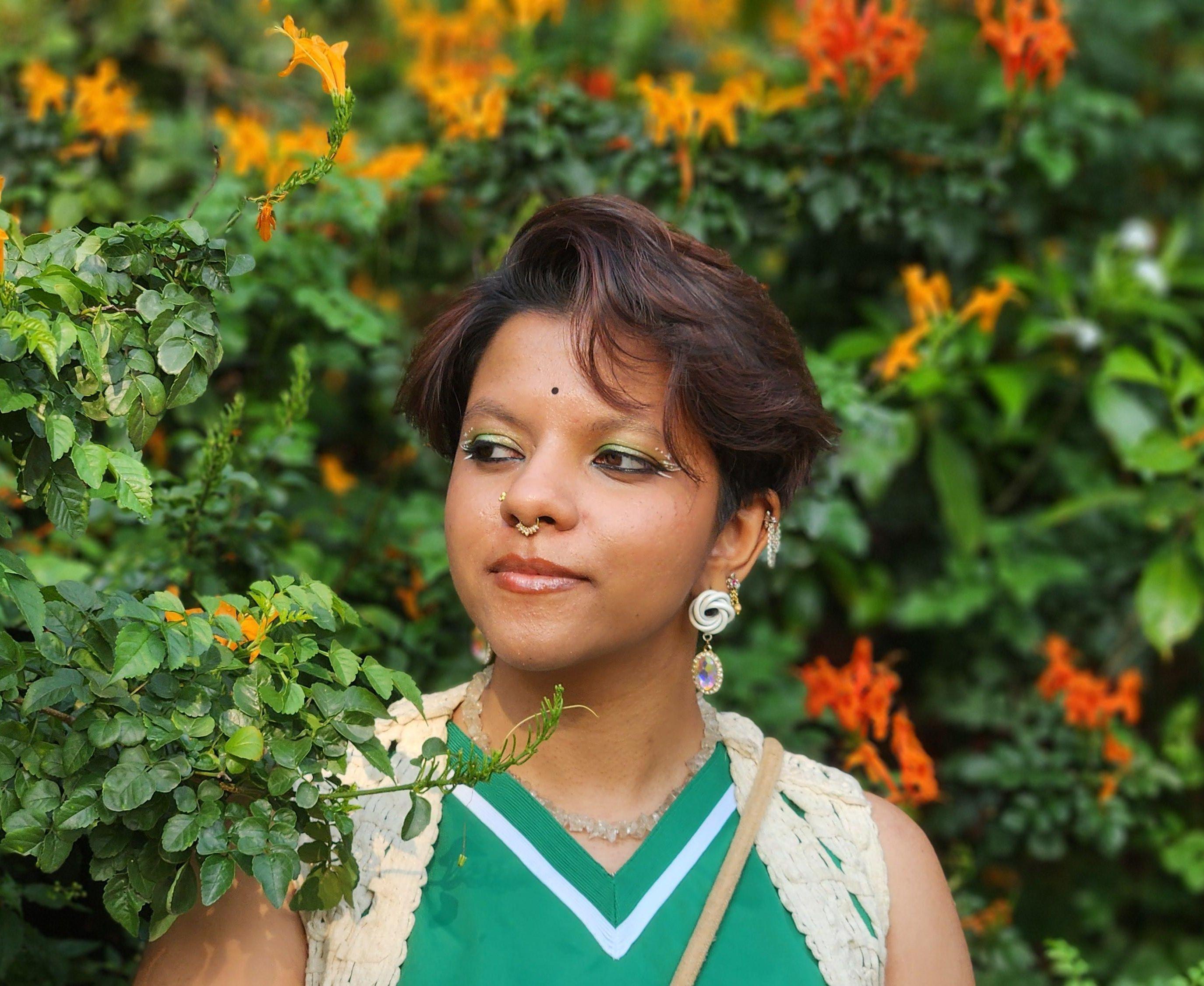
Adhrushya Ganesh is a graphic designer at Landor, a global brand agency, where she works across branding and packaging projects with teams in London and the USA. Adhrushya holds an MA in Graphic Design from Arts University Bournemouth, where she explored her interest in printmaking and physical media, developing a practice rooted in tactile experimentation and visual storytelling. Her work brings together playful thinking, thoughtful design and a love for creating distinctive visual worlds.